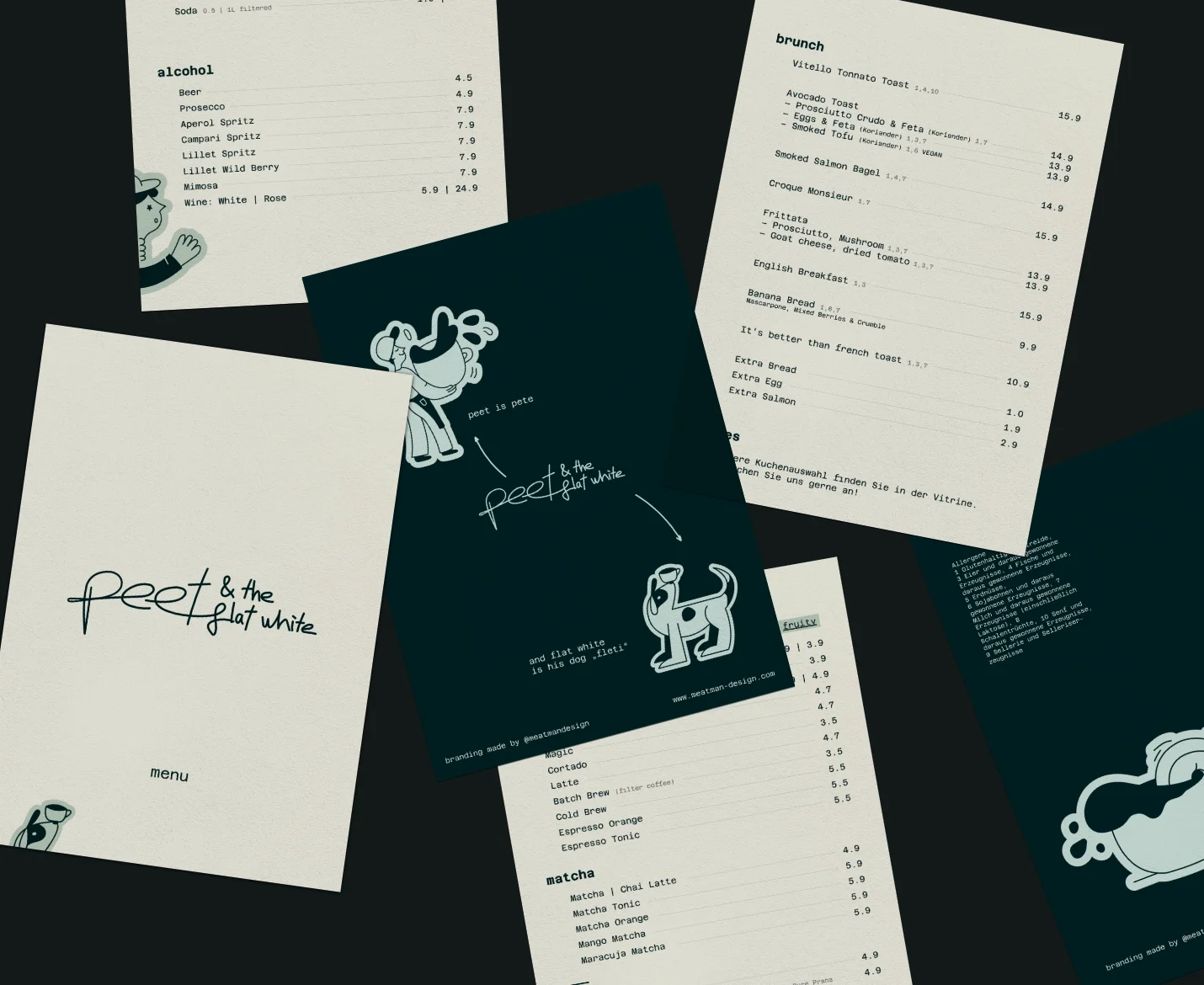
peet and the flat white
Visual Identity | Rebranding
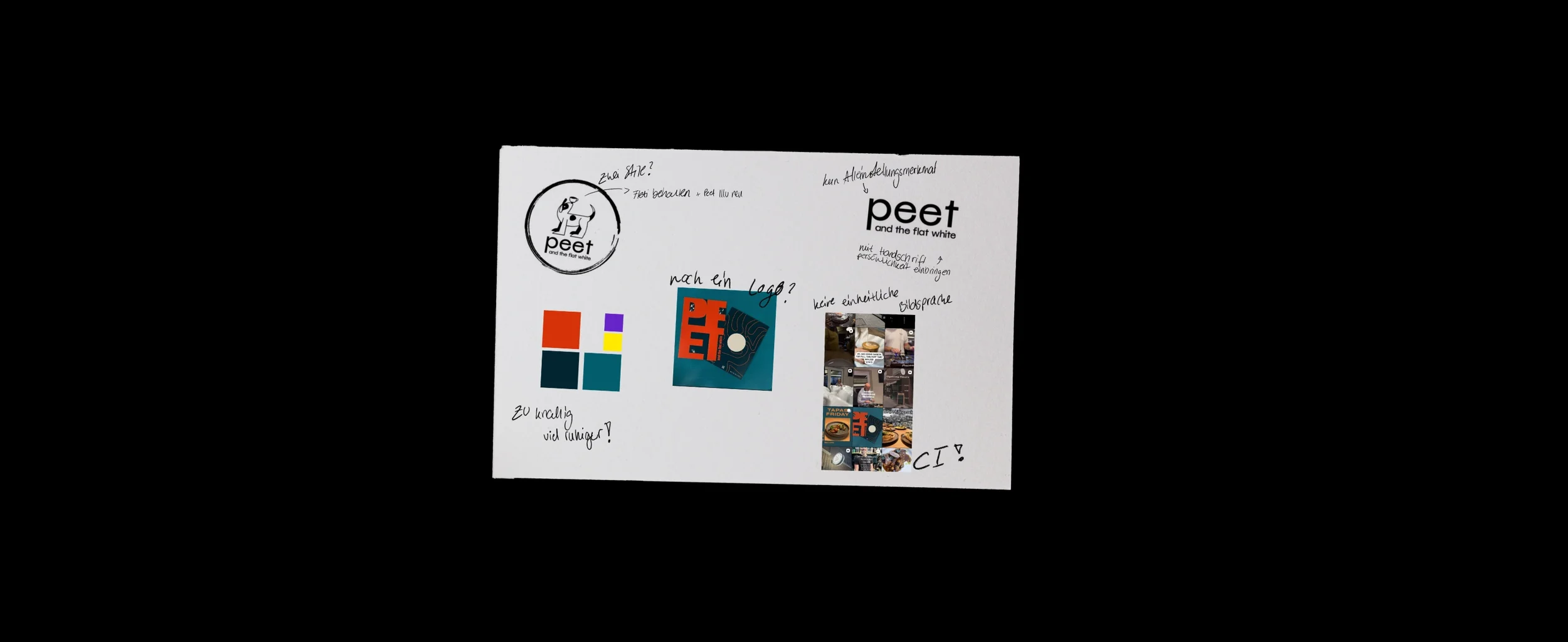
Peet came to me looking for someone to manage his social media. What he needed was more than just pretty Content. Peet's personality filled every corner of that café. None of it reached the street. I had walked past Café Peet and the Flat White more times than I can count. Never noticed it. That was the actual problem.
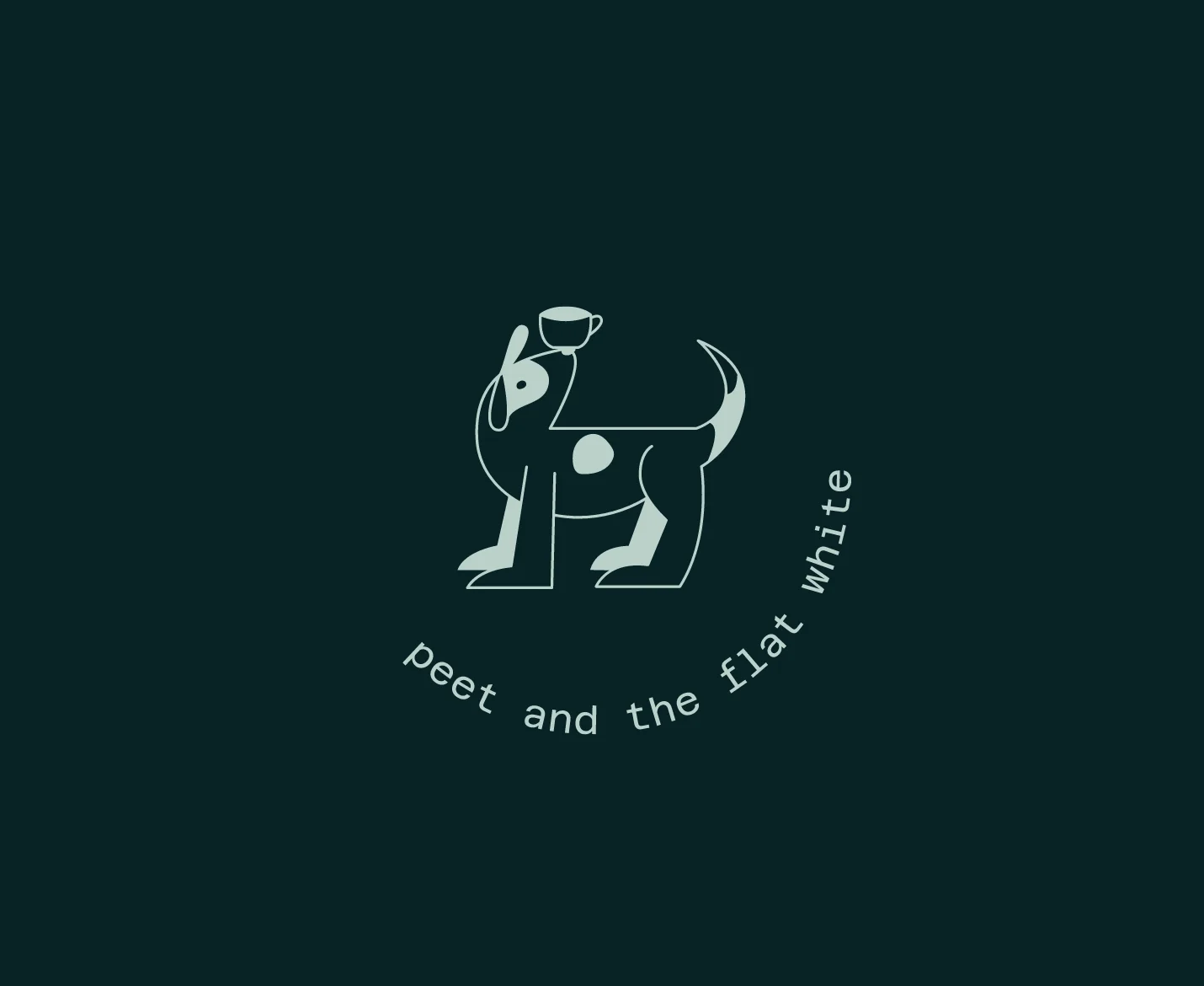
My Creative Direction: convey the atmosphere of the café in the CI. Make Peet the brand ambassador he already was, just not yet on paper. A consistent identity that lets customers feel what they're getting before they walk in.
Visual
Colors, shapes, fonts, and how they're used.
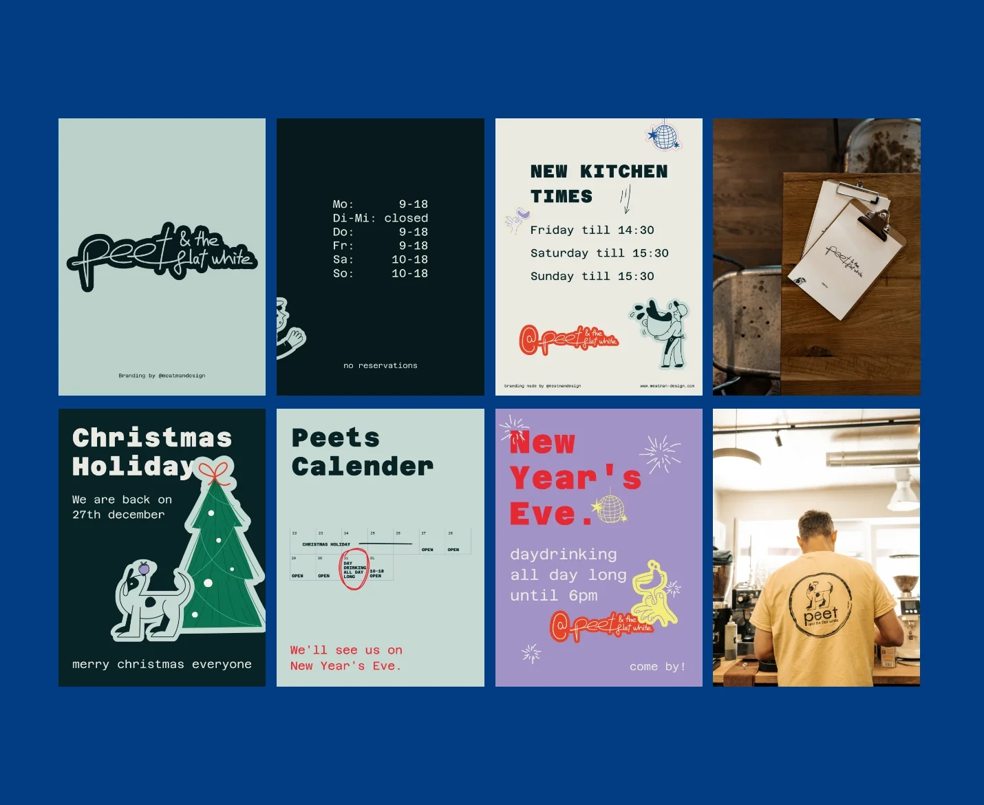
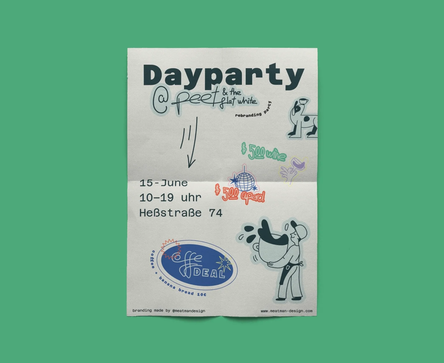
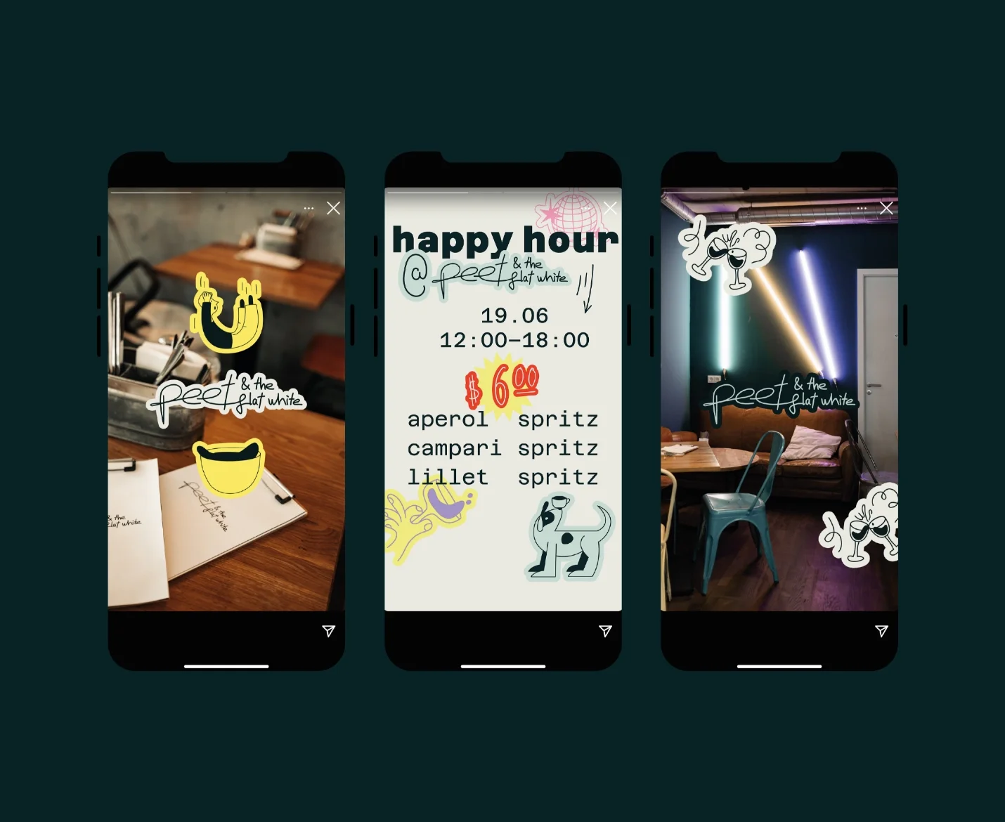
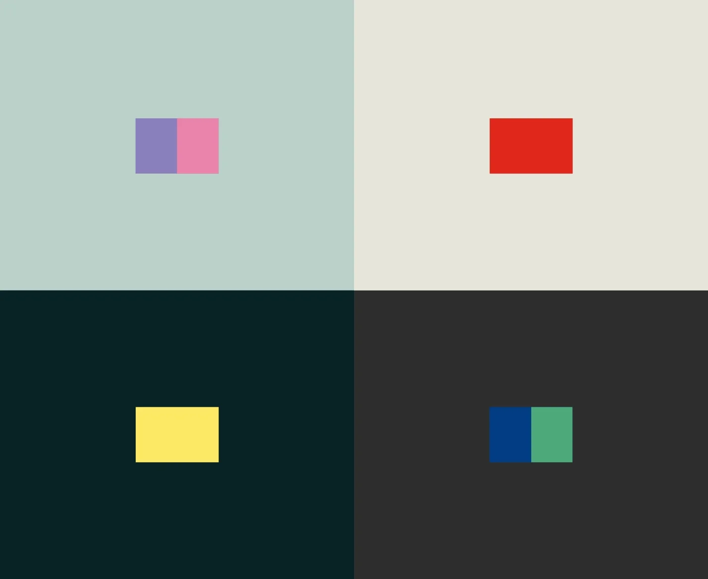
Calm, harmonious base tones, deep turquoise, warm beige, soft sage, set against accents that pop: red, yellow, blue, pink. Quiet ground, loud life on top. Like the café itself.
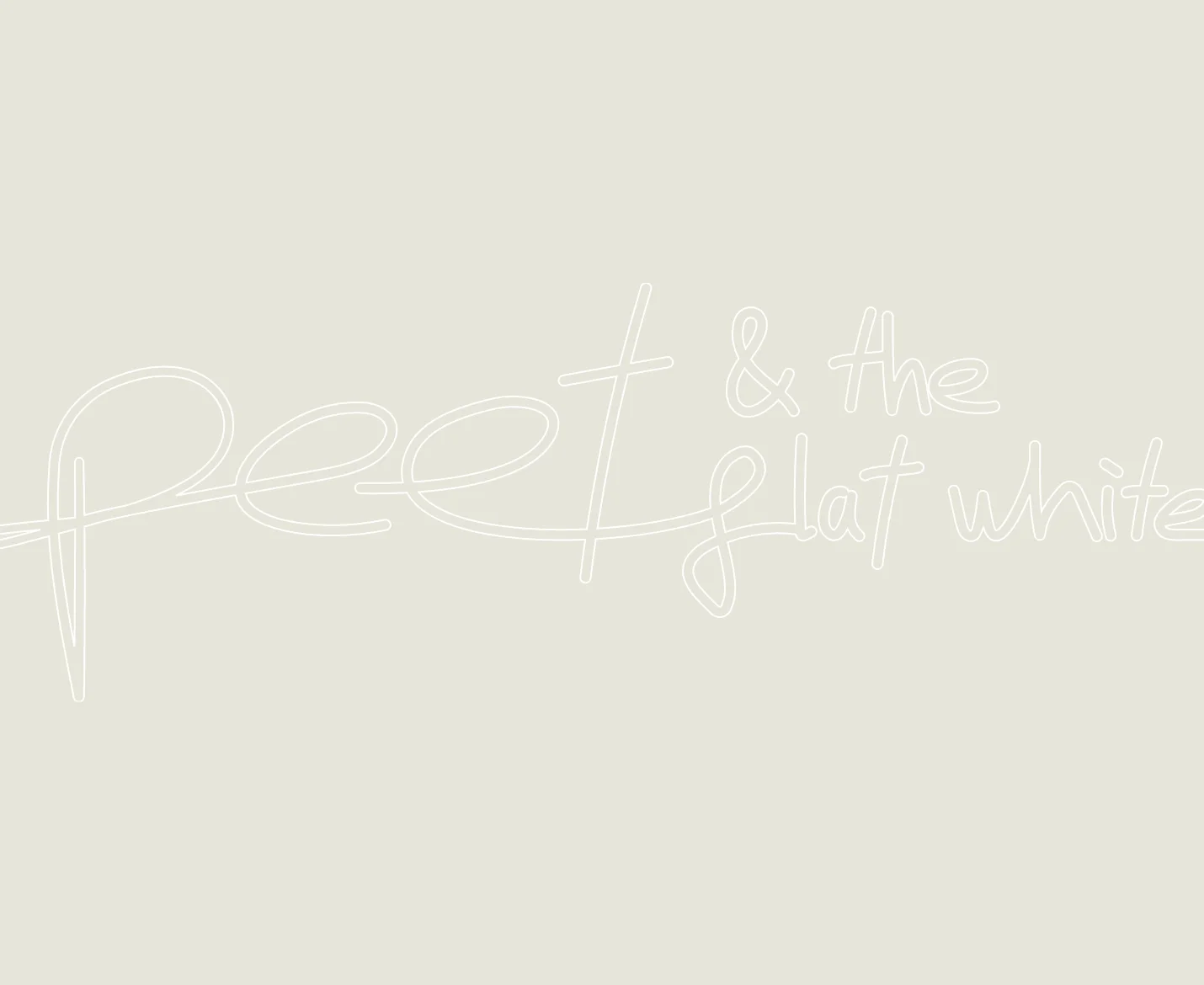
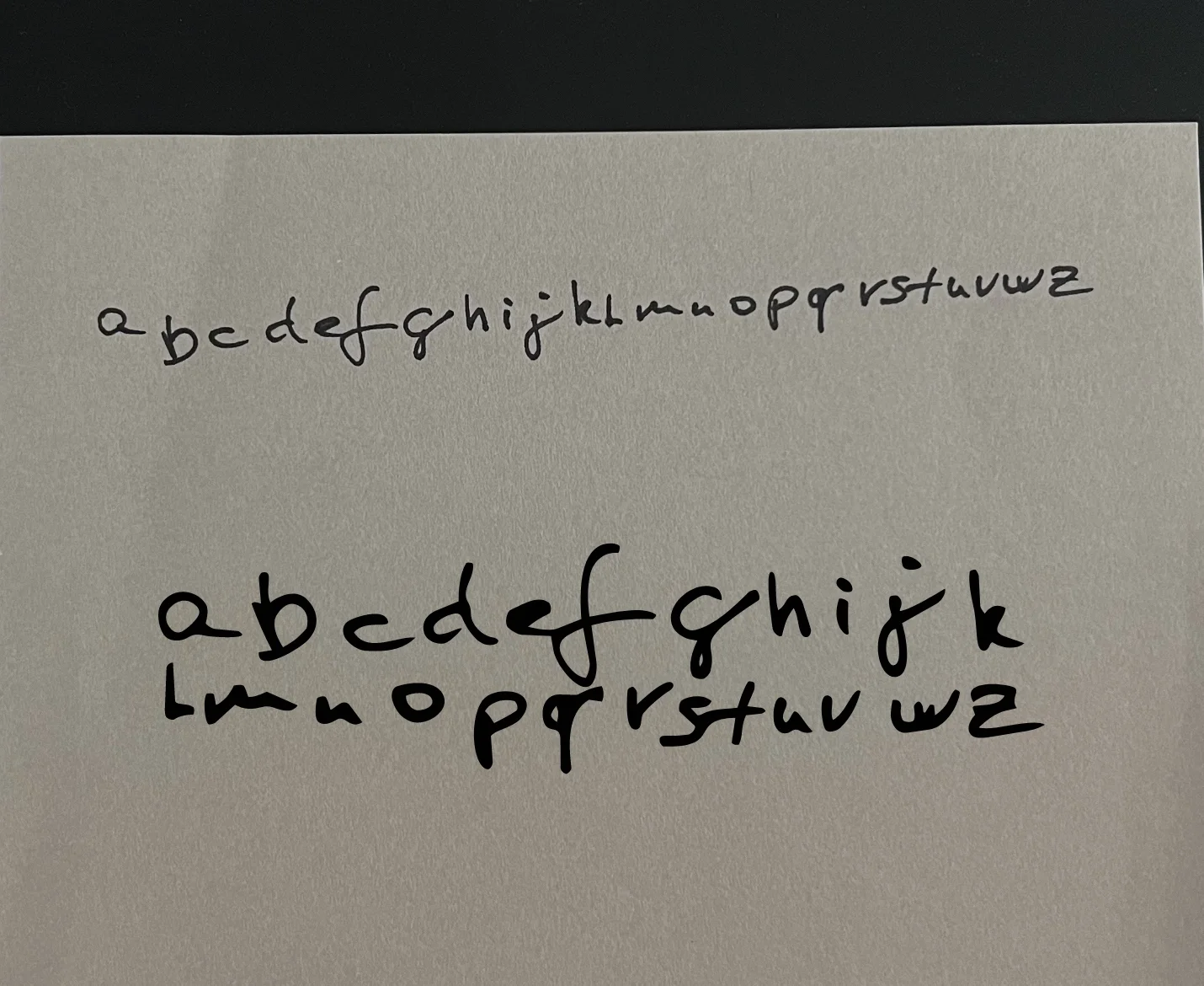
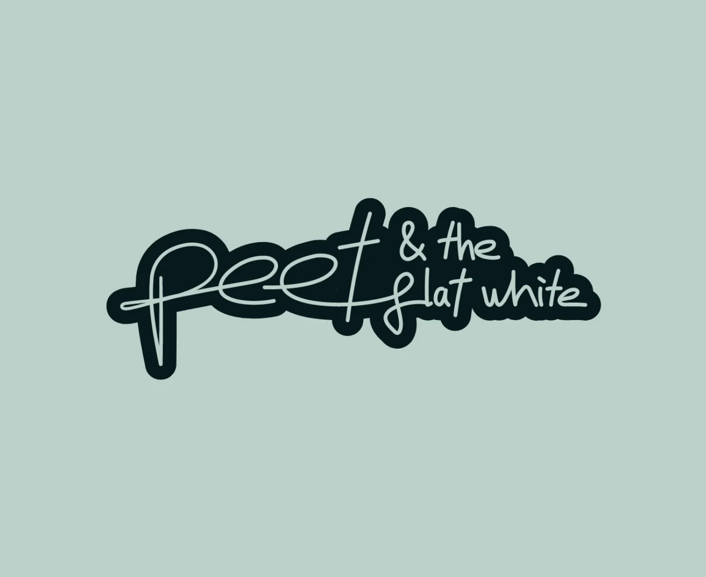
The wordmark is Peet's own handwriting. Not a font that looks personal, his actual hand, traced and turned into type. No typeface could carry what his signature already did.


Outcome
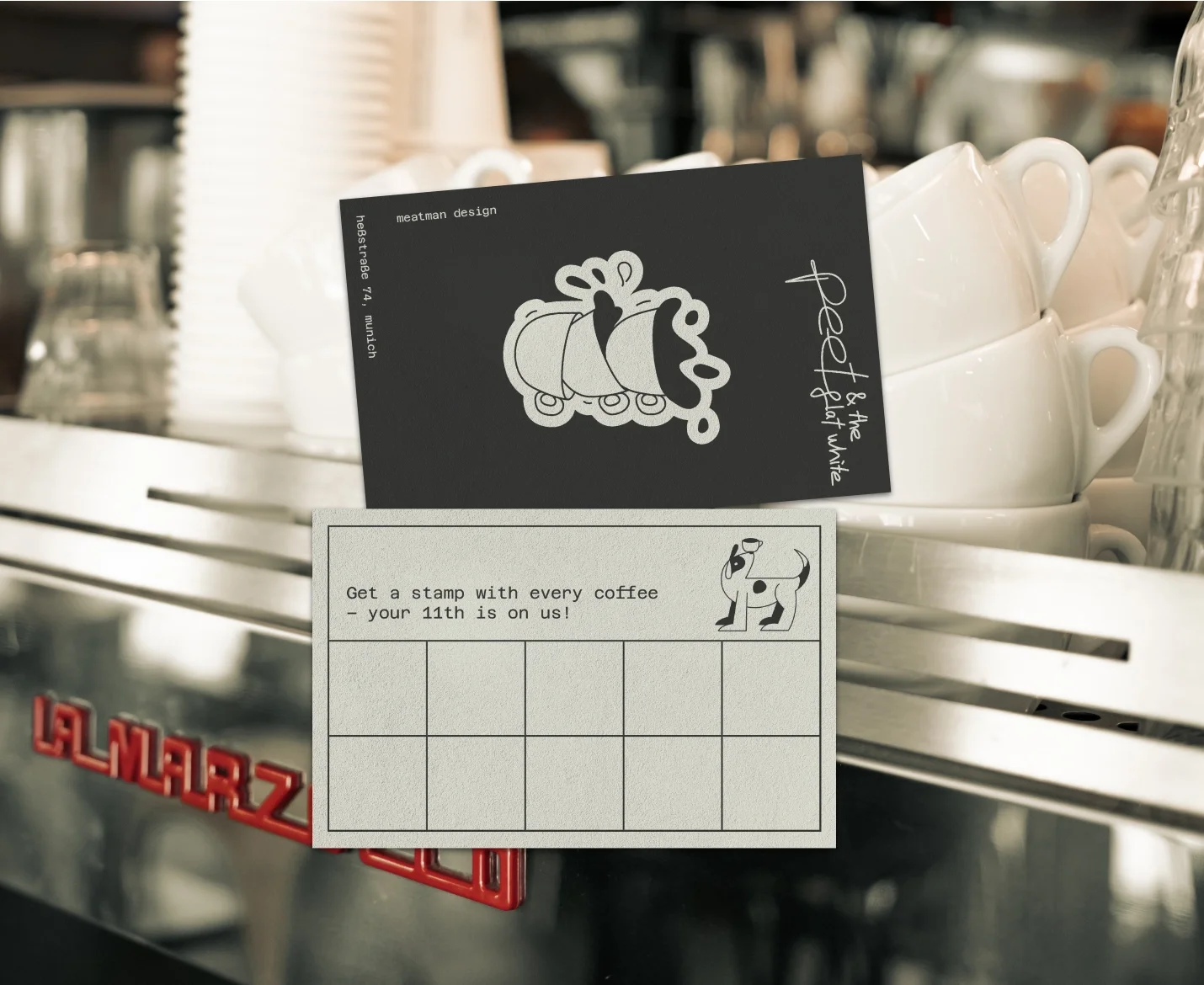
The mark moved onto stickers, onto cups, onto every touchpoint a guest could hold. Consistent, funny, interesting. The personality that was always inside the café finally stepped outside it.
People started recommending Peet not only for the coffee. For the place he'd built around it.