villa hoch vier
Visual Identity | Favorite Draft of the Project
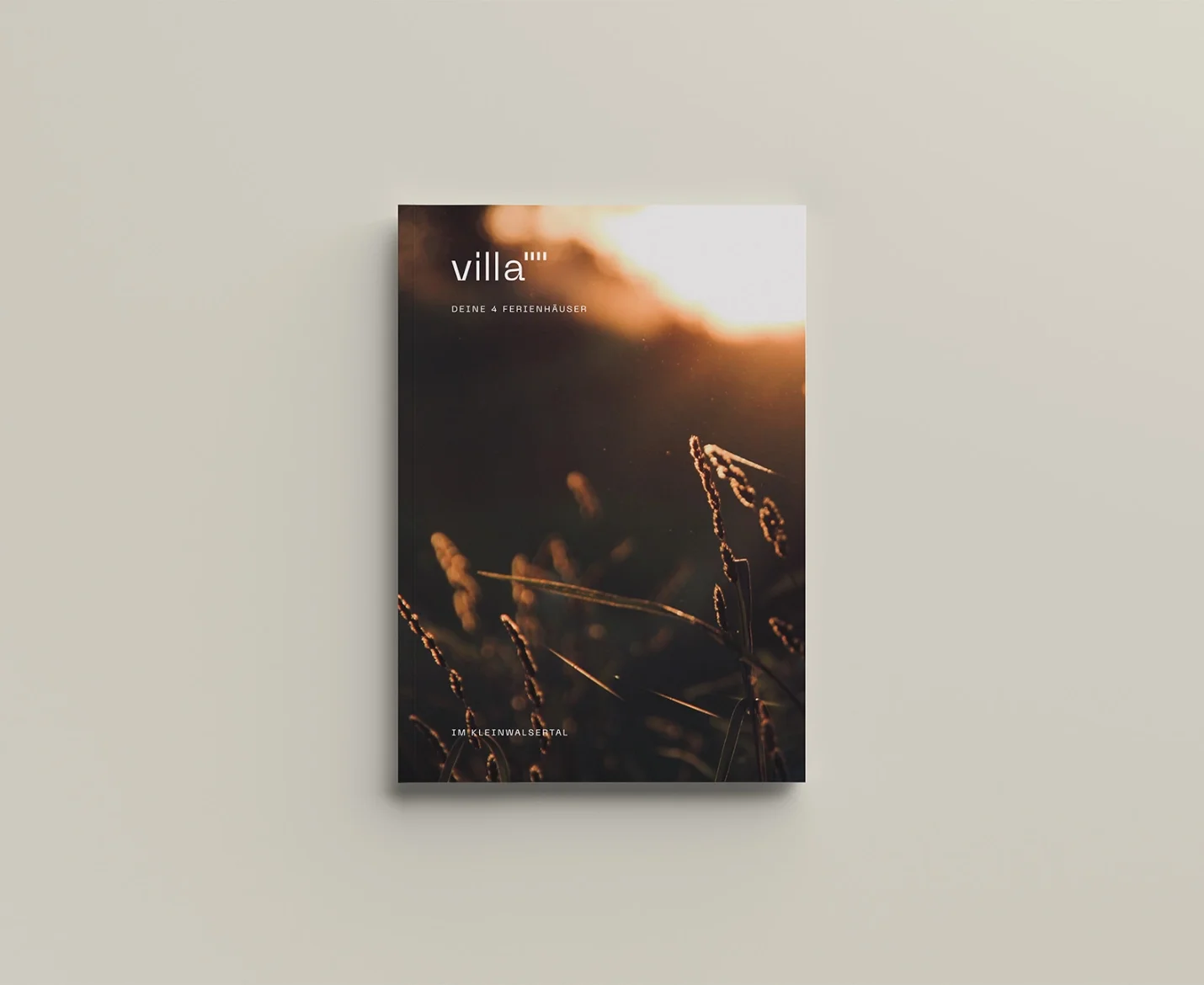
Four exclusive holiday homes in the Kleinwalsertal. High-end quality. High up the mountains. A feeling that needed a face.
Escape the city. Be in the moment.
I was brought in while the houses were still under construction. The name was set. The visual identity wasn't. My Creative Direction: build a brand around a feeling that didn't exist yet on paper — modern, but calm. Elevated, but never cold.
This is my favorite draft of the project.
Visual
Colors, shapes, fonts, and how they're used.
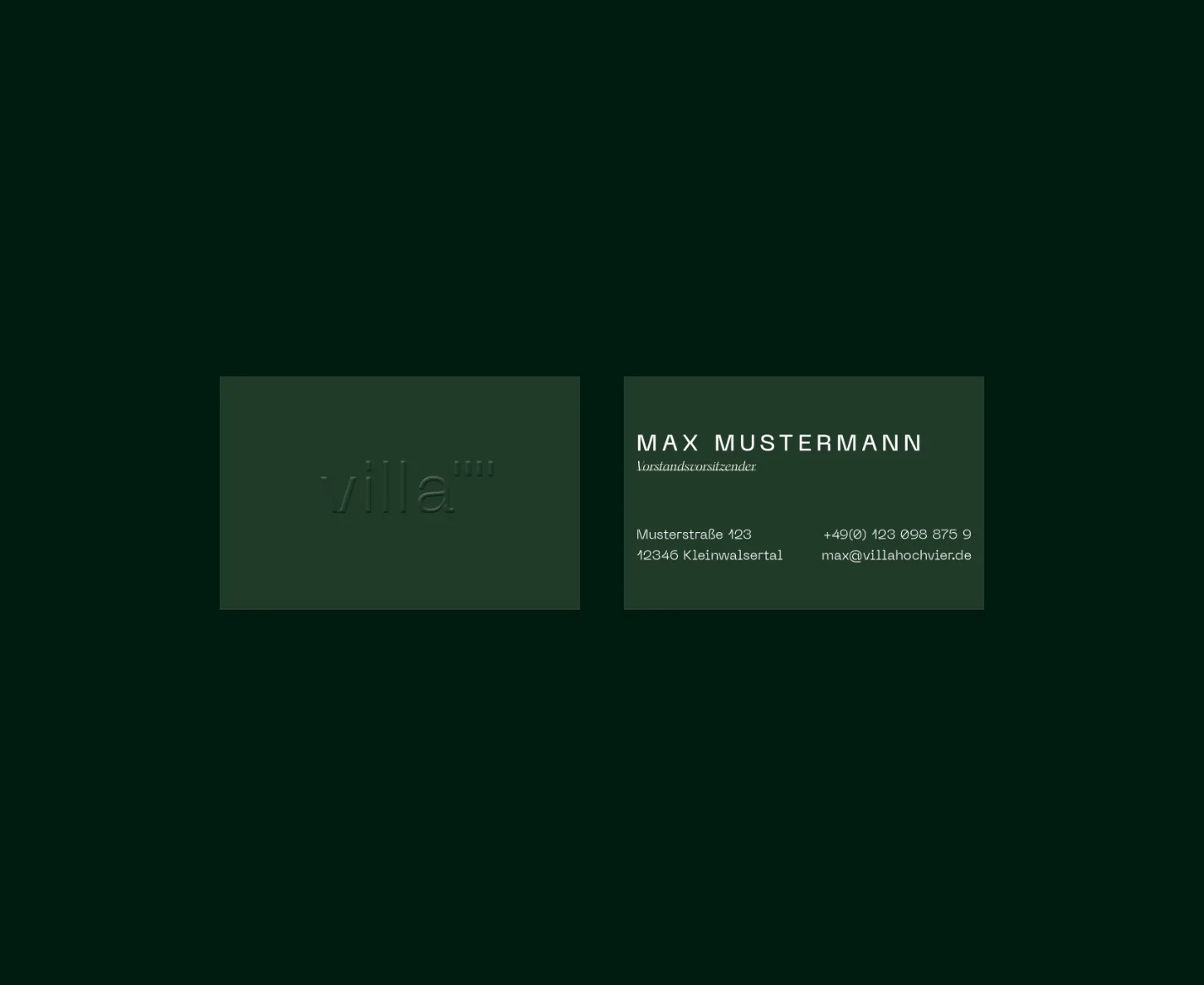
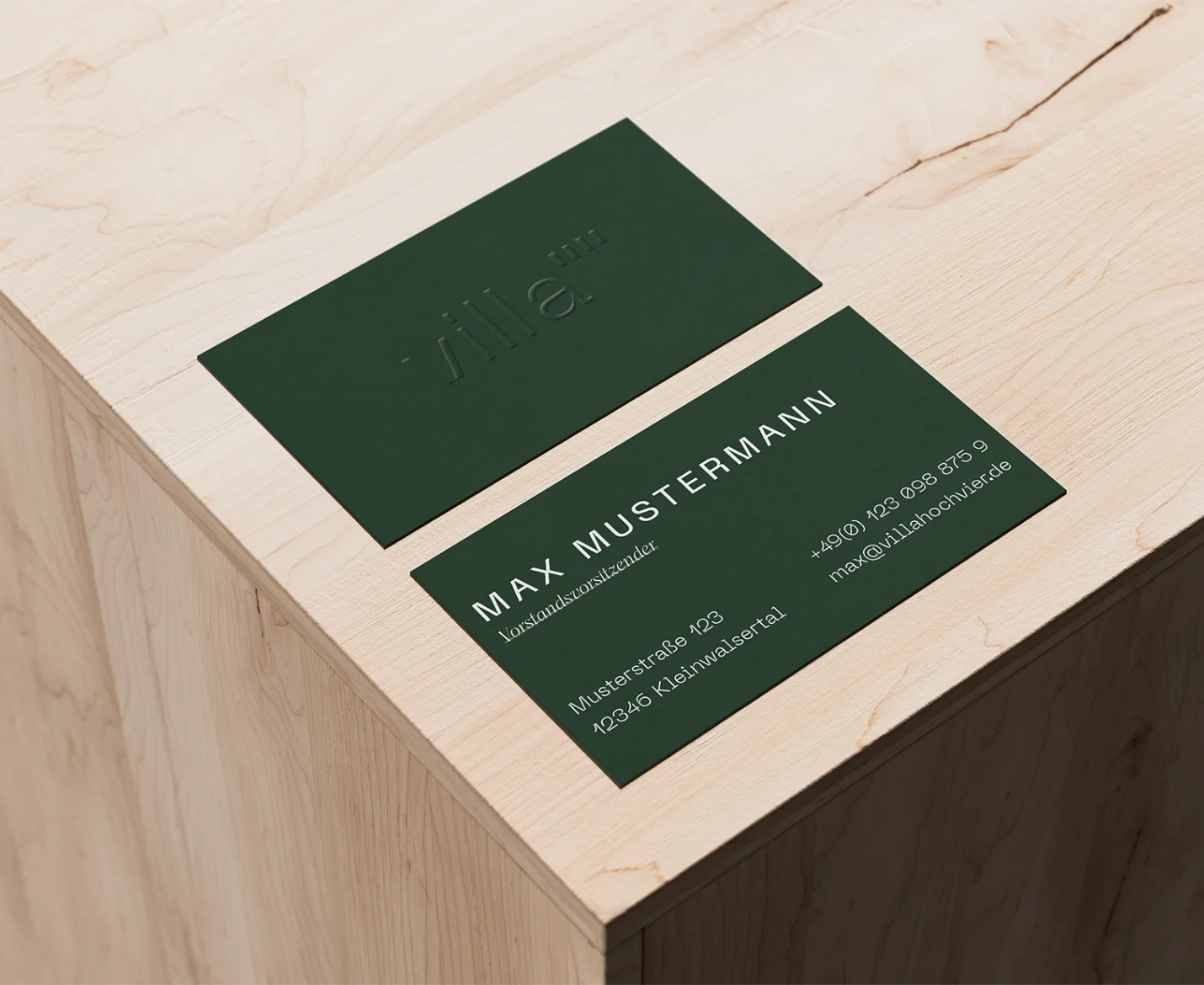
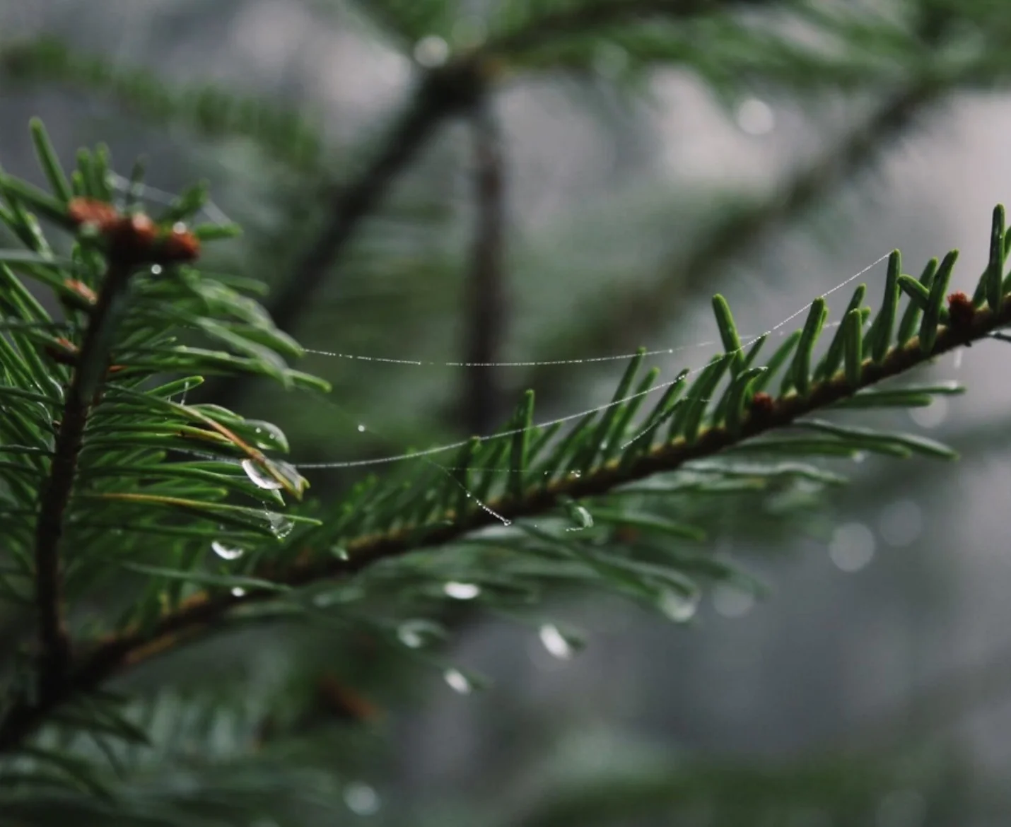
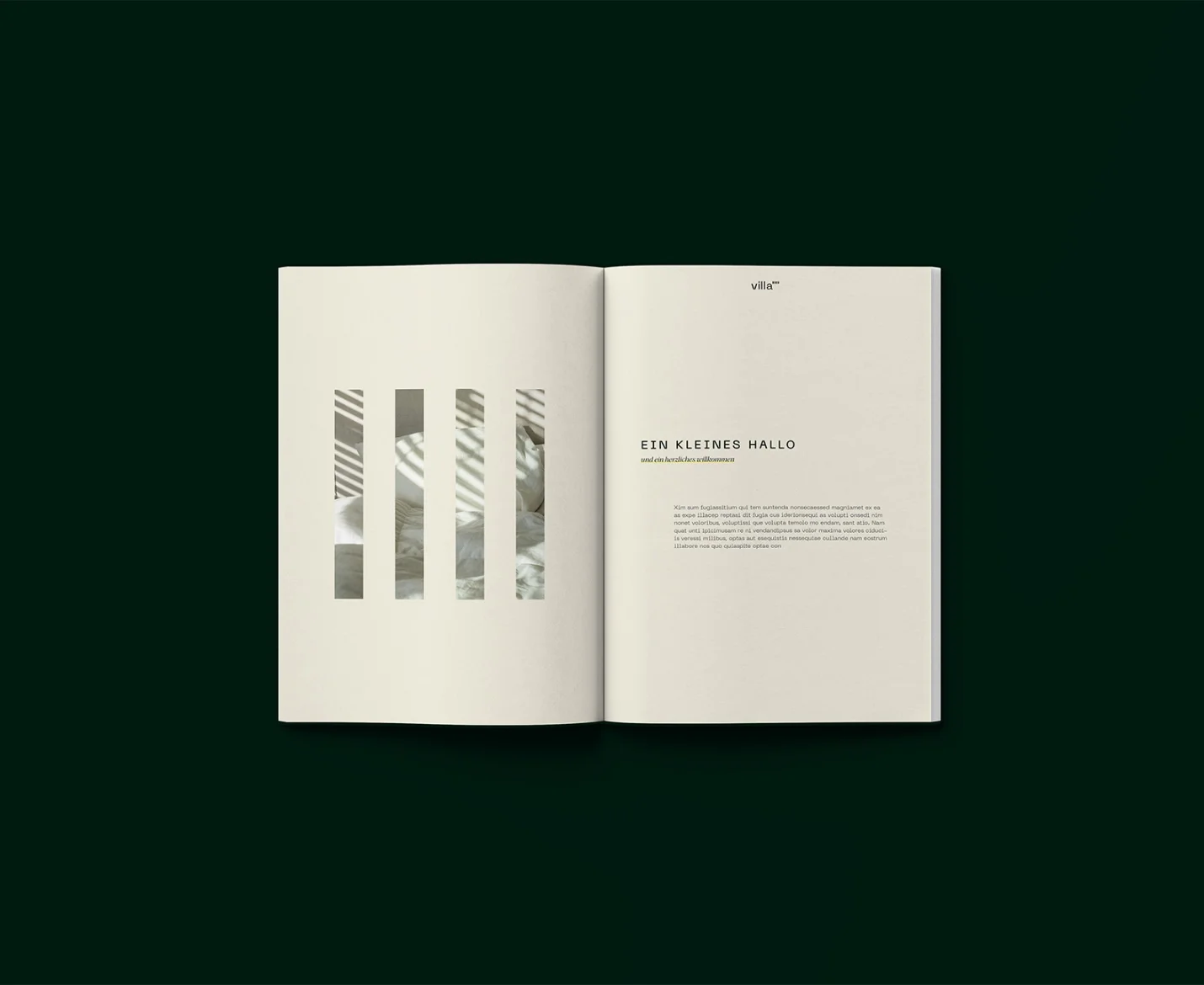
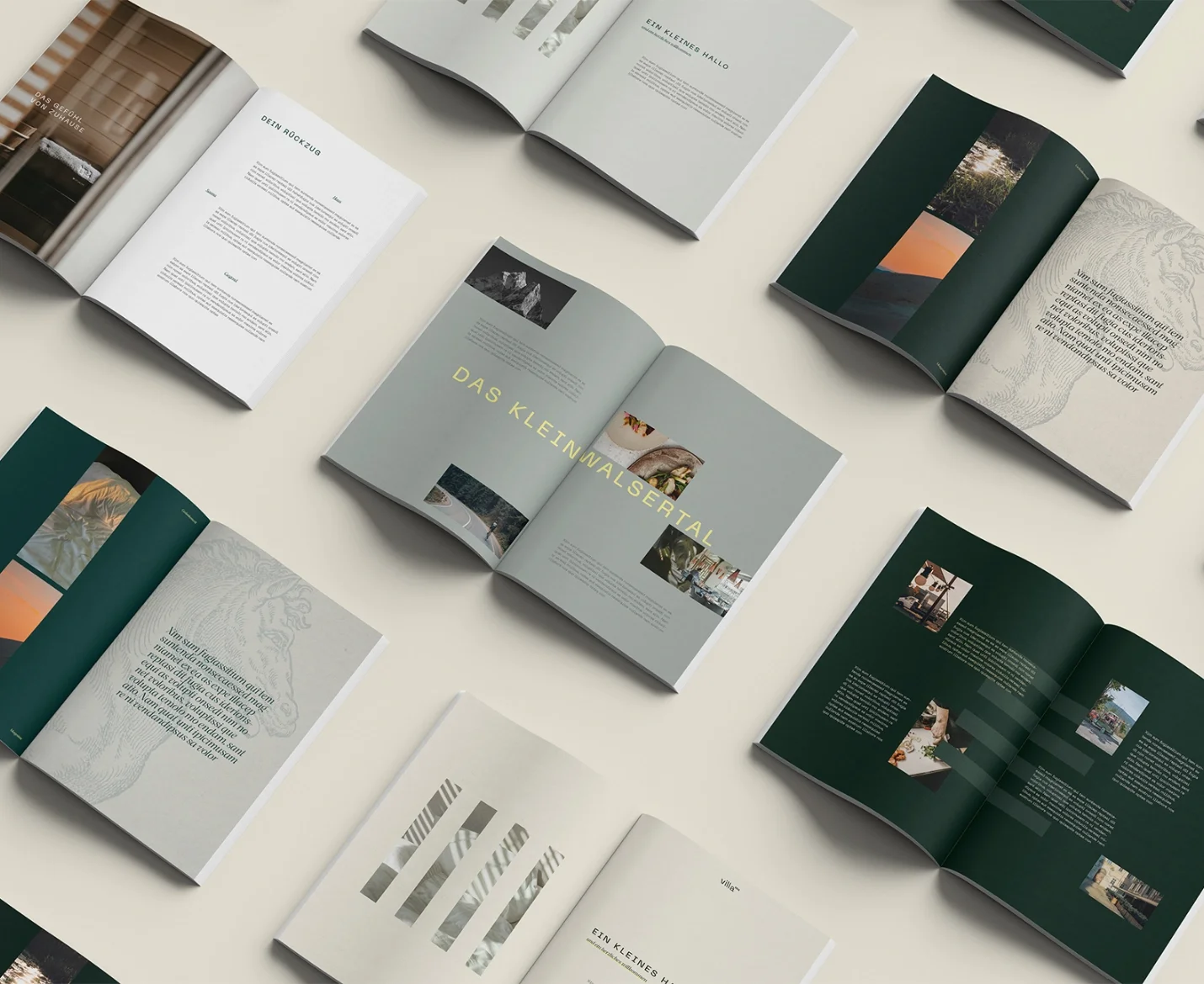
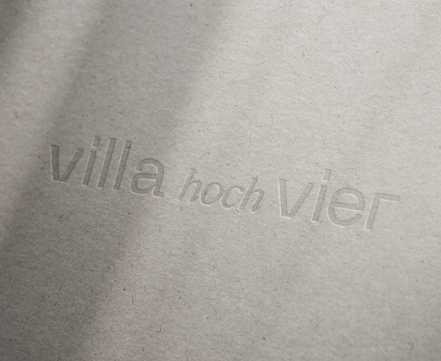
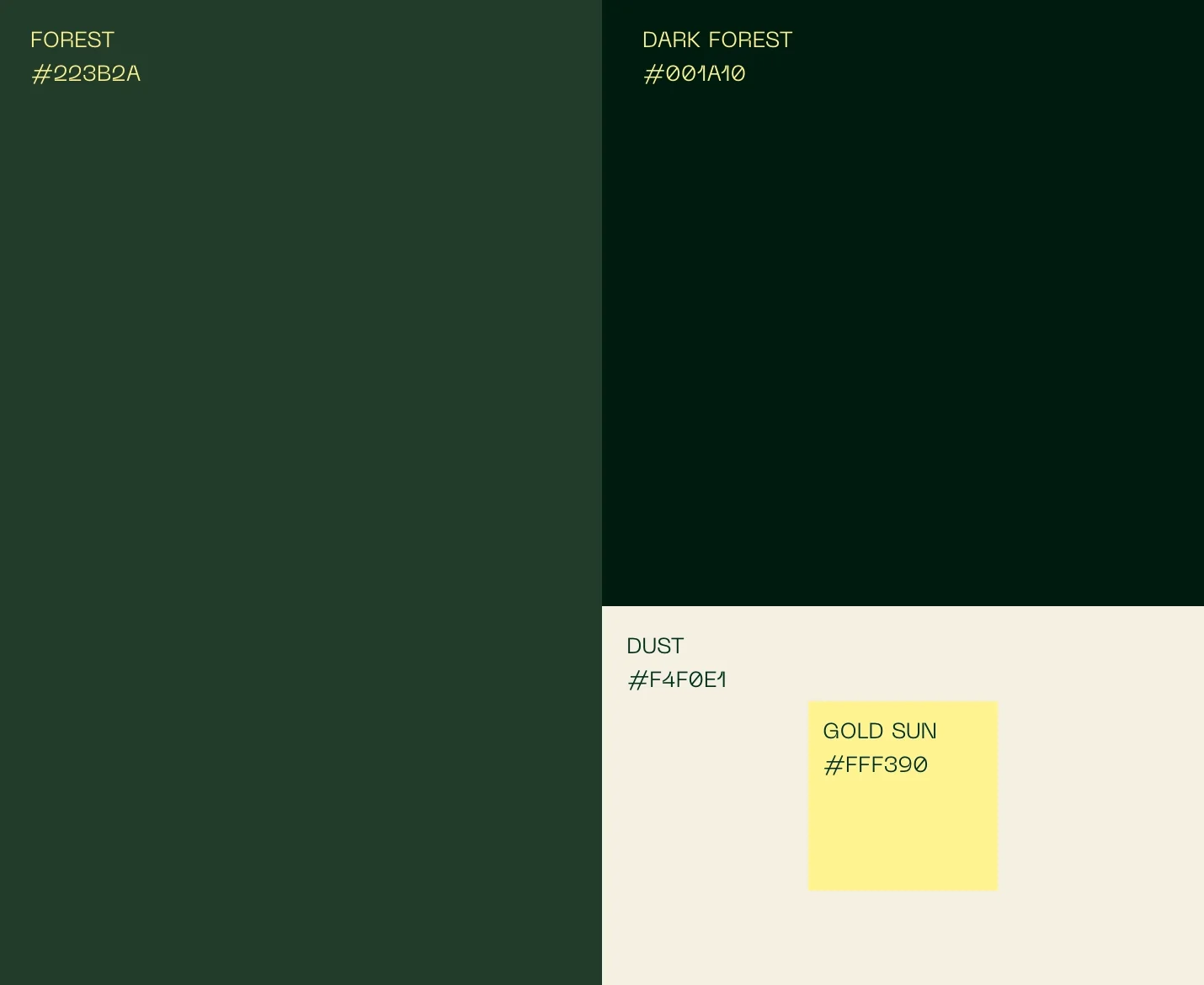
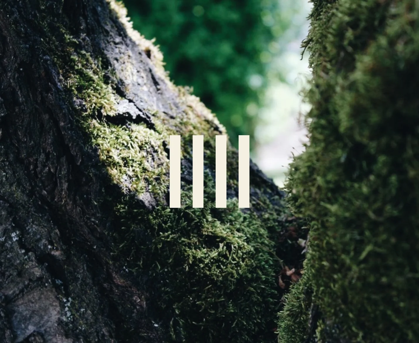
The colors come from the surroundings. Calm, refined, with a modern edge, just like the houses themselves. The buildings carry vertical wood façades, which I translated into the logo, softened into forms. A quiet nod to the architecture.
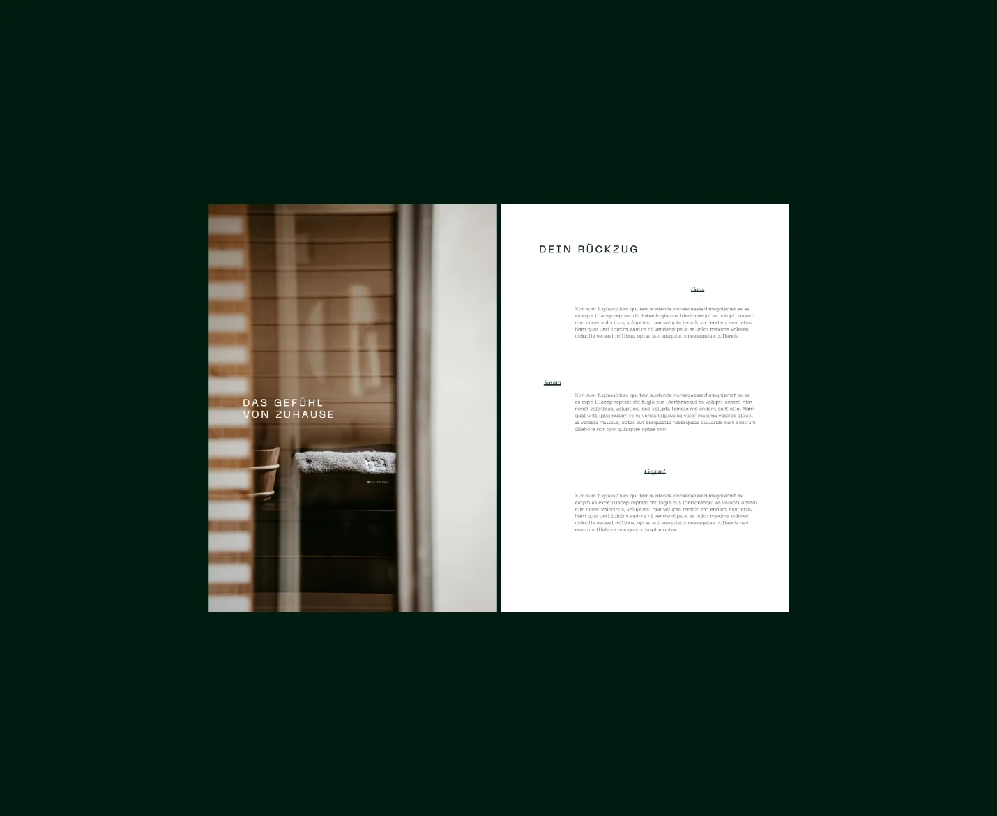
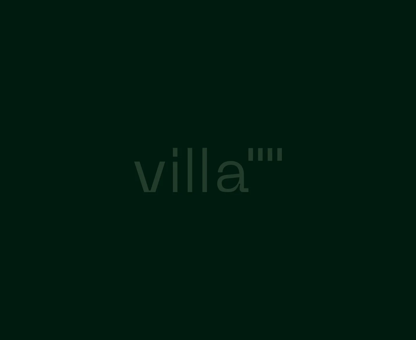
The wordmark breaks from that calm. Deliberately modern, almost in tension with the colors around it. That contrast is the point. Stillness and edge, held in the same identity.
Outcome
Logo, font, color, and form carry each other.
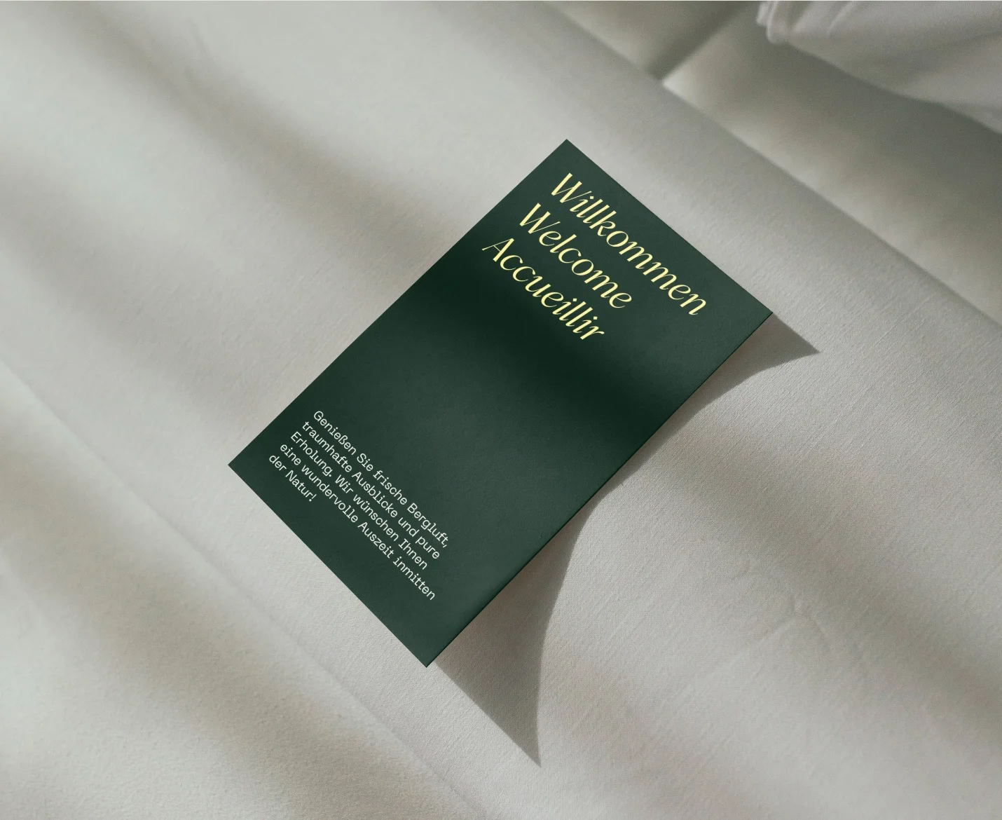
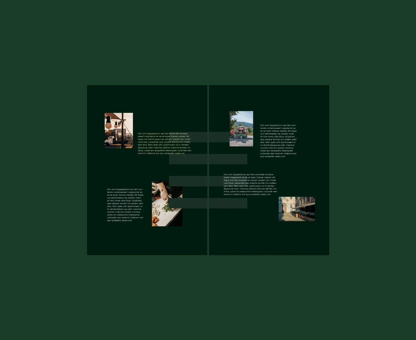
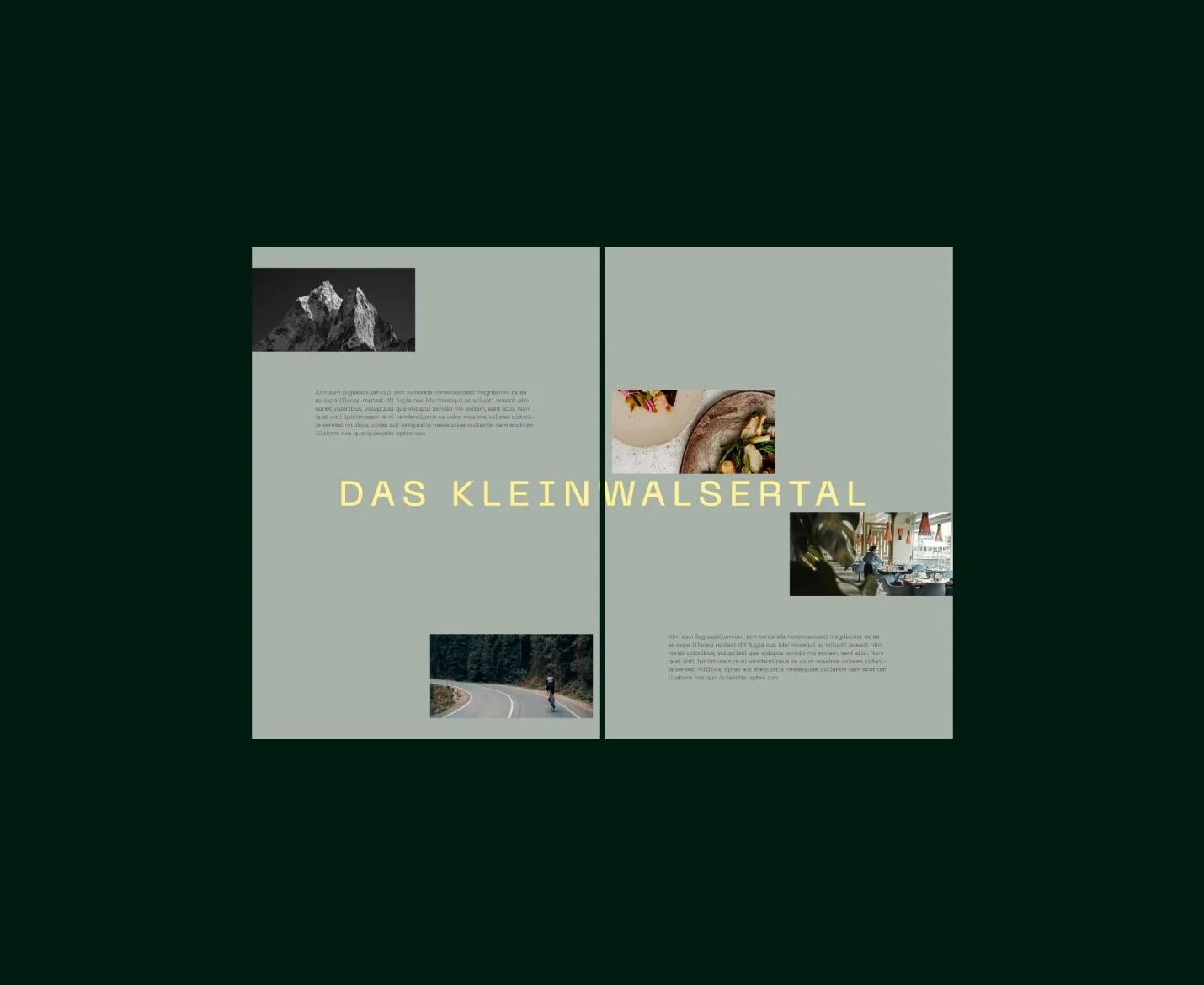
The logo repeats across all media, consistent but never static, recognizable in every application. A visual language that holds together regardless of where it's seen.
The vision becomes something you can actually look at. Enduring. Distinctive. Unmistakably unique.